Microsoft has announced the inevitable- SSRS is not long for the world.

There will apparently be no new features for RDL-based paginated reports moving forward unless MSFT changes course. All MSFT investments in data visualization and business intelligence are going to Power BI and other "Power Automate" tools.

This is not entirely a bad thing but I do have some thoughts on the sad reality that is the current state of Power BI, namely- its massive feature and extensibility limitations with respect to its predecessor, SSRS.
The first big one is report access. SSRS reports were available to anyone in the enterprise. And with custom authentication like extRSAuth, reports could be made available to any logged-in SaaS customer or otherwise authenticated client- for free. Most everything in Power BI requires a monthly subscription.

The second big one is scheduled reports and report archiving for auditing and comparison purposes via report snapshot functionality. Scheduled reports and snapshots are made possible via the PBI Report Server on-prem engine, but as the PBIRS on-prem engine is only supported through January of 2033 the question for organizations considering continuing with RDL-based schedulable and snapshottable reports is- "will we be cut off (unsupported) after January 2033?".
Sadly, everything is moving to a subscription-based model and this has everything to do with short-term "value demonstration" and the prioritization of short-term profits over long-term product excellence and long-term customer satisfaction. (more on this in a future post...).

If I had to make a bet on the future, based on MSFT's current avaricious and short-sighted, "Subscription-and-AI-everything-customer-opinion-and-developer's-be-damned*" business direction- SSRS and its successor PBIRS will be completely phased out after 2033 and the only option will be Power BI reports, with Power BI offering some expensive, newfangled version of schedulable .pbix reports. Probably called something ridiculous like "Fabric Delivery Service". I doubt they will continue to support snapshot auditing capabilities, but they should.
Lastly, a sad consequence of the universal move away from code sharing, "actually free/unlimited use" software and software extensibility in general, is that Power BI binary files (.pbix) cannot be utilized outside of being decompiled by a Power BI editor. In the heydays of SSRS, you could view any .rdl, .rsd or .rds file and immediately inspect a report, dataset or data source (XML) file and make edits on the fly through a text editor or an API. This is no longer possible.
There have been innumerable SSRS scripts implemented at organizations to update large batches of data sources, datasets and reports to point to new data sources, data fields or to make mass updates to column text, report labeling or table definitions. So the removal of this functionality is kind of a big (raw) deal.
Paginated RS Reports (.rdl)

RDL report files are XML-based and report definitions are clearly defined in the files; fortunately PBIRS is supporting paginated reports and the PBI Report Server database and engine for several more years.
Interactive PBI Visualizations (.pbix)

PBI report files are illegible compiled binary code; report definitions can only be decompiled, viewed and modified through tools like the online Power BI editor or downloadable Power BI Desktop programs. PBI interactive reports are the MSFT-recommended approach for all data reporting (except apparently, their own as is demonstrated below in the example of a SSMS 21/SQL Server 2025 standard, RDL-based database report).
There is a long way to go before SSRS reports disappear from the MSBI landscape completely however; SSRS will continue to be supported until January 11, 2033 according to Microsoft's recently posted Reporting Services consolidation FAQ.
In fact, if you look at Microsoft products like SSMS 21, you'll see regular old SSRS/RDL reports being rendered through the Report Viewer control when running reports for SSIS execution history, Job execution history, Database Standard Reports and many other SSMS reports.


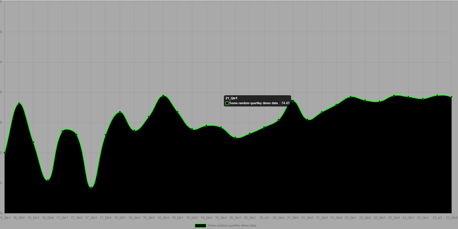
Comparing search terms via Google Trends it is clear that the push to Power BI accelerated in 2017 and has ramped up to the point where general interest in SSRS is negligent compared to interest in Power BI, despite SSRS offering robust, extensible on-prem report solutions for free and Power BI be buggy, considerably "locked down" and charging a relatively expensive monthly per-user subscription.

But this is merely how marketing-sales-product singularity and product obsolescence works. If Galactus (MSFT) deems it so, it'll be so.

*we have come a long, long way from then-Microsoft CEO Steve Ballmer's infamous but earnest, "Developers!!, Developers!!, Developers!!" rant at a Windows conference in 2006. 😐
References:
https://www.mssqltips.com/sqlservertip/6867/ssrs-vs-power-bi