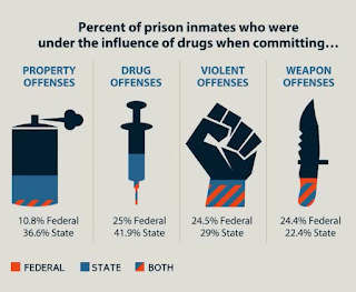
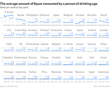
Each of these rules will help guide you to the delivery of a compelling and effective visual story
U.S. Presidential Elections 1900-2024
A picture really can depict 1000s of words
From the Industrial Revolution to WWI to the Great Depression to the New Deal to WWII to the Red Scare to the Civil Rights Movement to Neoconservatism to Neoliberalism to 9/11 to the Great Recession to MAGA, these small multiples charts beautifully encapsulate U.S. presidential elections and the attendant American political eras that fueled them in these past 124 years.
Major U.S. Economic Events
1929-1932 Great Depression
The gridlines are distracting and unnecessary but this chart, and the informational callouts, explain the stock market crash that caused the Great Depression
Post-WWII Boom
Oil Prices and Inflation
The U.S. experienced huge inflation spikes in the 1970s due to oil price "shocks" and again in 2022 due to Russian oil sanctions and COVID stimulus
1980s Savings and Loan Crisis
Well over 1000 banks failed as a result of the money market and junk-bond deregulation that led to the S&L crisis; this hasn't happened before or since
Millenium Dot-Com Bubble
Between 1998 and 2002 the NASDAQ rose from ~2000 to over 5000 only to come crashing back to just over ~1000 by the end of the bubble burst
2007-2009 Great Recession
Due to internationally linked financialization, the Great Recession impacted not just the U.S. economy, but economies across the world
2020 COVID and U.S. Unemployment
Music Sales
Whenever you present a story about data you will invariably be displaying some values (along a time series axis, or in static/isolation) within a categorization-based visual. The four primary chart types are Comparison, Relationship, Distribution and Composition. We will briefly pose the questions that illustrate what each of these chart types aims to answer.
- Comparison: How much of each subgroup exists in relation to the other subgroups?
- Relationship: How did a value change over time? (or change in relation to some other non-temporal metric like "how are various foreign currency exchange rates impacted by the movement of the U.S. federal funds (interest) rate?")
- Distribution: What is the concentration of values within different percentiles if you chart the data along a linear scale?
- Composition: What are the sizes of each of the constituent parts that comprise the whole of the thing you are trying to depict or explain?
Other key data visualization concepts to know and always be considering...:
Avoid Chartjunk: The goal should be to encode as much information as possible using near-exclusively "data ink", and as low a level of "non-data ink" as possible. Charts and graphs that contain excessive non-data ink (also called "chartjunk"), which is any chart content that does not communicate information relevant to your data visualization, are only going to confuse the consumer of your data visualization and hinder the expression of the message your visualization is meant to convey.
Chartjunk should be ruthlessly excised wherever it is found. Only include the data ink that serves the communication of your data visualization. All extra clutter will detract from and degrade your dataviz and your message- which is the entire purpose of graphs and charts.
Know Your Audience: It is important that you know your audience. A chart presented in a scientific or academic journal is often expected to contain values derived from complex ratios and formulas and labeling using esoteric language; a chart presented for general consumers in a newspaper or magazine is not. You should have an idea of what the baseline expectations are for the data you are presenting and ensure that you communicate your visualization in a way that is easy for your target audience to understand.
Data Integrity: Many charts have been used as propaganda and to otherwise mislead people. This is done by using outright fake data or trying to elicit specious insights from thin data sets that do not provide a complete picture of what a particular data point or set of data points means within the context of other data it is a part of.
References:


