Showing posts with label DataViz. Show all posts

Storytelling with data

 
Each of these rules will help guide you to the delivery of a compelling and effective visual story


U.S. Presidential Elections 1900-2024

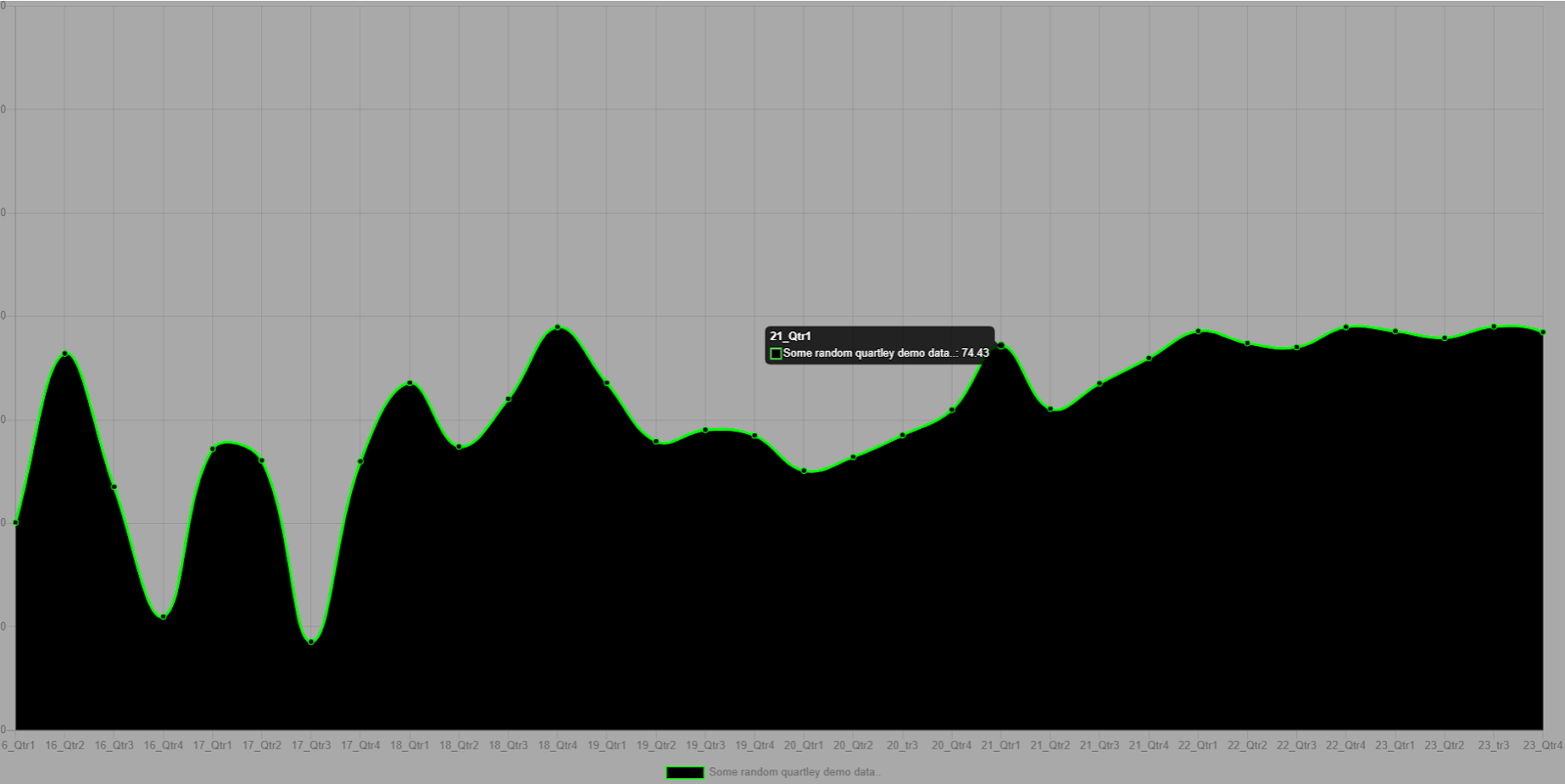
A picture really can depict 1000s of words


From the Industrial Revolution to WWI to the Great Depression to the New Deal to WWII to the Red Scare to the Civil Rights Movement to Neoconservatism to Neoliberalism to 9/11 to the Great Recession to MAGA, these small multiples charts beautifully encapsulate U.S. presidential elections and the attendant American political eras that fueled them in these past 124 years.


Major U.S. Economic Events

1929-1932 Great Depression

The gridlines are distracting and unnecessary but this chart, and the informational callouts, explain the stock market crash that caused the Great Depression


Post-WWII Boom

The United States was the biggest gainer among the countries whose GDP per capita spiked after WWII


Oil Prices and Inflation

The U.S. experienced huge inflation spikes in the 1970s due to oil price "shocks" and again in 2022 due to Russian oil sanctions and COVID stimulus


1980s Savings and Loan Crisis

Well over 1000 banks failed as a result of the money market and junk-bond deregulation that led to the S&L crisis; this hasn't happened before or since


Millenium Dot-Com Bubble

Between 1998 and 2002 the NASDAQ rose from ~2000 to over 5000 only to come crashing back to just over ~1000 by the end of the bubble burst


2007-2009 Great Recession

Due to internationally linked financialization, the Great Recession impacted not just the U.S. economy, but economies across the world


2020 COVID and U.S. Unemployment

This graph illustrates the impact that COVID had on U.S. unemployment, which subsided once vaccines were developed, re-opening economies worldwide 


Music Sales

Fascinating composition bar chart showing how music sales have shifted from vinyl to cassettes to CDs to mp3s to streaming


Whenever you present a story about data you will invariably be displaying some values (along a time series axis, or in static/isolation) within a categorization-based visual. The four primary chart types are Comparison, Relationship, Distribution and Composition. We will briefly pose the questions that illustrate what each of these chart types aims to answer.
  • Comparison: How much of each subgroup exists in relation to the other subgroups?
  • Relationship: How did a value change over time? (or change in relation to some other non-temporal metric like "how are various foreign currency exchange rates impacted by the movement of the U.S. federal funds (interest) rate?")
  • Distribution: What is the concentration of values within different percentiles if you chart the data along a linear scale?
  • Composition: What are the sizes of each of the constituent parts that comprise the whole of the thing you are trying to depict or explain?
  
Other key data visualization concepts to know and always be considering...:

Avoid Chartjunk: The goal should be to encode as much information as possible using near-exclusively "data ink", and as low a level of "non-data ink" as possible. Charts and graphs that contain excessive non-data ink (also called "chartjunk"), which is any chart content that does not communicate information relevant to your data visualization, are only going to confuse the consumer of your data visualization and hinder the expression of the message your visualization is meant to convey.

Chartjunk should be ruthlessly excised wherever it is found. Only include the data ink that serves the communication of your data visualization. All extra clutter will detract from and degrade your dataviz and your message- which is the entire purpose of graphs and charts.

Know Your Audience: It is important that you know your audience. A chart presented in a scientific or academic journal is often expected to contain values derived from complex ratios and formulas and labeling using esoteric language; a chart presented for general consumers in a newspaper or magazine is not. You should have an idea of what the baseline expectations are for the data you are presenting and ensure that you communicate your visualization in a way that is easy for your target audience to understand. 

Data Integrity: Many charts have been used as propaganda and to otherwise mislead people. This is done by using outright fake data or trying to elicit specious insights from thin data sets that do not provide a complete picture of what a particular data point or set of data points means within the context of other data it is a part of.  


References:


extRS Portal: a modern SSRS client


ExtRS Portal provides a blueprint for extending the functionality of Reporting Services 


extRS (pronounced, "extras") is a modern SSRS client for distributing and reading reports; with some extras. A demo of the app is linked here: https://extrs.net
   
The audience is SSRS report users (you know, the people you need to justify having enterprise reporting in the first place). So things like applying item-level RS security, managing users, and adding, editing and deleting SSRS catalog items and other system-level properties are not part of this client- at least not yet.

The aim here is to make SSRS at least slightly more interesting, accessible and useable for information consumers. This particuliar deployment of the extRS.Portal web client is connected to a report server with custom authentication (extRSAuth) which gets passed the normally required "Windows authentication" hamstring of the default SSRS installation. 

This wrapper and extension UI not only improve the user authentication experience and dynamism of SSRS parameter behaviors in the UI but also provide SSRS admins and other users with rich enterprise reporting usage and delivery data.

Enabled are the most of the features contained in Reporting Service's built-in Report Portal at /reports.

I have disabled some things like deleting and uploading items for the sake of keeping my demo of the app small and simple.

The source code can be found here: https://github.com/sonrai-LLC/extRS


Charts Suggestions - "A Chart Chooser" (edited)

Just because you can do things with "non-data ink"* does not mean you should do things with "non data ink". Below is a useful guide to charts for presenting different perspectives of data. I have crossed out the ones that are unanimously decried in the data visualization community for having confusing elements that do not effectively communicate the meaning of data.

Bar charts. Line charts. Dot or scatter plots. And bullet charts for really communicating a lot of information in a small space. That's really all you need.


The "Thought-Starter" above, edited to cross out (in red) all useless and confusing visuals to AVOID


Bullet charts are highly effective at displaying sub-ranges within a spectrum; the sole max line communicates threshold or "target" values


Focus on ensuring that every piece of ink in your chart is conveying some kind of useful information. If not, delete it. Blank space is better than distracting ink.

If you need an example of "distracting, non-data ink" then look no further than the following almost headache-inducing example:

I imagine the author of this chart was more interested in the art than the meaning of the data; this is a really bad data visualization


Another simple yet very powerful data visualization technique is to show the same type of chart repeated for contiguous time intervals or for different groups at the same point in time. An example is the following small multiples chart on alcohol consumption in different countries:


Small multiples charts really highlight the outliers (S. Korea?!!)


For more on the use of small multiples for effective data visualizations, I show more examples here: kpitsimpl: Small Multiples (are awesome) a while back. KEEP IT SIMPL.


Small Multiples (are awesome)

To keep it short and sweet let's go with the definition:

"A small multiple (sometimes called trellis chart, lattice chart, grid chart, or panel chart) is a series of similar graphs or charts using the same scale and axes, allowing them to be easily compared. It uses multiple views to show different partitions of a dataset."

Read any serious visual communication guide and it will invariably highlight this powerful tool we have at our disposal when we have the data (we almost always have the data).

A pair of Small Multiples example quite pertinent to the current times followed by some other good ones:


This CNN.com graphic captures a running snapshot of the "new case/spread" curve trajectory of individual states


This clearly communicates how each state unemployment picture fared from 1976-2009


This SM visual shows population change over time by country (look at Mexico's growth since 1960)


ChartJS for Data Vizualiizations

I came across ChartJS about 2 years ago while debugging code from another, similar data visualization technology inside an AngularJS app.


ChartJS is a flexible JavaScript data visualization framework which allows for some pretty powerful integrations and customizations


The concept is you have a "<canvas>" DOM element, which you transform into a ChartJS chart via some JavaScript initialization. After that your tasks are simply finding the data you want to render and deciding the options of exactly how you want the chart visual to appear.

You can do some really neat and dynamic stuff with ChartJS.

I have used a lot of charting frameworks, and it does not get more flexible or simple than this:
 <html>  
 <head>  
 <script src="https://cdn.jsdelivr.net/npm/chart.js@2.8.0"></script>  
 </head>  
 <body>  
 <div>  
 <canvas id="myChart" style='background-color:darkgray; width:100%; height:100%;'></canvas>  
 </div>  
 <script>  
 var ctx = document.getElementById('myChart').getContext('2d');;  
 var chart = new Chart(ctx, {  
   type: 'line',  
   data: {  
     labels: ['16_Qtr1', '16_Qtr2', '16_Qtr3', '16_Qtr4', '17_Qtr1', '17_Qtr2', '17_Qtr3', '17_Qtr4', '18_Qtr1', '18_Qtr2', '18_Qtr3', '18_Qtr4', '19_Qtr1', '19_Qtr2', '19_Qtr3', '19_Qtr4', '20_Qtr1', '20_Qtr2', '20_tr3', '20_Qtr4', '21_Qtr1', '21_Qtr2', '21_Qtr3', '21_Qtr4','22_Qtr1', '22_Qtr2', '22_Qtr3', '22_Qtr4', '23_Qtr1', '23_Qtr2', '23_tr3', '23_Qtr4'],  
     datasets: [{  
       label: 'Some random quartley demo data..',  
       backgroundColor: 'black',  
       borderColor: 'lime',  
       data: [40.2, 72.88, 47.1, 22, 54.43, 52.18, 17.1, 52, 67.2, 54.88, 64.1, 78, 67.2, 55.88, 58.1, 57, 50.2, 52.88, 57.1, 62, 74.43, 62.18, 67.1, 72, 77.2, 74.88, 74.1, 78, 77.2, 75.88, 78.1, 77, 70.2, 72.88, 77.1, 62, 64.43, 62.18, 67.1, 72, 67.2, 54.88, 44.1, 28, 27.2, 25.88, 38.1, 37, 40.2, 42.88, 44.1, 52, 54.43, 52.18, 67.1, 82, 87.2, 84.88, 84.1, 88, 87.2, 95.88, 108.1, 127]  
     }]  
   },  
    "options": {  
       "legend": {"position": "bottom"}      
     }  
 });  
 </script>  
 </body>  
 </html>  


Reference: https://www.chartjs.org/

SSRS REST API v2

Here is a response from the SSSR REST API in action.. (you can access a lot more SSRS item properties and customize at will once you know the API)


The SSRS API v2 has far more functionality than v1, but they essentially work the same. You must be authenticated to the SSRS report server you are targeting (localhost in this case) to make web GET/POST requests to the API.

Once auth'd you can push and pull any useful SSRS data pretty easily to make SSRS do some pretty cool things it can't do out of the box..


This is the SSRS API as accessed through a web browser; simply give your .NET app an HttpClient and you can make use of all these responses; it's just JSON...


You can get a collection of SSRS catalog items as in the example above (folders, reports, KPIs) by just specifying the action name, or you can select an individual item by putting the item GUID in parenthesis in the API request URL:


You can access individual items in the API via GUID in parens after the API action name.


Common Useful SSRS API v2 Actions:
  • Reports
  • Datasets
  • Data Sources
  • Folders
  • Schedules
  • Subscriptions
  • Comments
  • KPIs
  • CatalogItems (everything)


Example of a .NET Standard library with an HttpService abstacting the SSRS API calls:
 namespace ExtRS  
 {  
   public class SSRSHttpService  
   {  
     const string ssrsApiURI = "https://localhost/reports/api/v2.0";  
     HttpClient client = new HttpClient(new HttpClientHandler() { UseDefaultCredentials = true });  
         public async Task<GenericItem> GetReportAsync(Guid id)  
     {  
       client.BaseAddress = new Uri(ssrsApiURI + string.Format("/reports({0})", id));  
       var response = await client.GetAsync(client.BaseAddress);  
       var odata = response.Content.ReadAsStringAsync().Result;  
       return JsonConvert.DeserializeObject<GenericItem>(odata);  
     }  
   }  
 }  
This is verbose to better break down the steps of what is happening on the ExtRS service end


A very basic class designed to demonstrate using SSRS API Response to create a .NET object:
 using Newtonsoft.Json;  
 using System.Collections.Generic;  
 namespace ExtRS  
 {  
   public class GenericItem  
   {  
     [JsonProperty("@odata.context")]  
     public string ODataContext { get; set; }  
     [JsonProperty("Id")]  
     public string Id { get; set; }  
     [JsonProperty("Name")]  
     public string Name { get; set; }  
     [JsonProperty("Path")]  
     public string Path { get; set; }  
   }  
 }  
The power of the SSRS API is limited primarily your imagination- lots of customization can be made


And finally, called from a Controller Action in an MVC app:
 using System;  
 using System.Web.Mvc;  
 using System.Threading.Tasks;  
 using ExtRS;  
 namespace Daylite.Controllers  
 {  
   public class ReportsController : Controller  
   {  
     public SSRSHttpService service = new SSRSHttpService();  
     public async Task<ViewResult> GetReportsAsync()  
     {  
       return View("Index", await service.GetReportsAsync());  
     }  
     public async Task<ViewResult> GetFoldersAsync()  
     {  
       APIGenericItemsResponse result = await service.GetFoldersAsync();  
       return View("Index", result);  
     }  
     public async Task<ViewResult> GetReportAsync(Guid id)  
     {  
       GenericItem result = await service.GetReportAsync(id);  
       return View("Index", result);  
     }  
   }  
 }  


Reference: https://github.com/Microsoft/Reporting-Services/tree/master/APISamples