Just because you can do things with "non-data ink"* does not mean you should do things with "non data ink". Below is a useful guide to charts for presenting different perspectives of data. I have crossed out the ones that are unanimously decried in the data visualization community for having confusing elements that do not effectively communicate the meaning of data.
Bar charts. Line charts. Dot or scatter plots. And bullet charts for really communicating a lot of information in a small space. That's really all you need.
The "Thought-Starter" above, edited to cross out (in red) all useless and confusing visuals to AVOID
Bullet charts are highly effective at displaying sub-ranges within a spectrum; the sole max line communicates threshold or "target" values
Focus on ensuring that every piece of ink in your chart is conveying some kind of useful information. If not, delete it. Blank space is better than distracting ink.
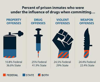
If you need an example of "distracting, non-data ink" then look no further than the following almost headache-inducing example:
I imagine the author of this chart was more interested in the art than the meaning of the data; this is a really bad data visualization
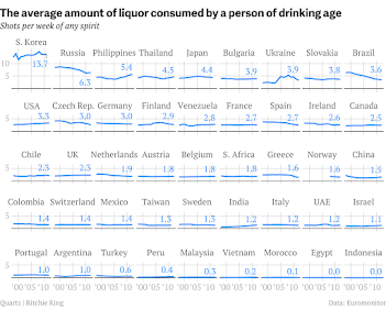
Another simple yet very powerful data visualization technique is to show the same type of chart repeated for contiguous time intervals or for different groups at the same point in time. An example is the following small multiples chart on alcohol consumption in different countries:
Small multiples charts really highlight the outliers (S. Korea?!!)
For more on the use of small multiples for effective data visualizations, I show more examples here: kpitsimpl: Small Multiples (are awesome) a while back. KEEP IT SIMPL.


No comments:
Post a Comment